Rachelle Baisa
  • Home
  • About
  • Student Work
    • Student Work - Home
    • Self-Affinity Typeface
    • Sunbaked Space Menu
    • Muraled Meadows
    • PSA Animation
  • Honors Program
    • Honors Program - Home
    • Una the Sheep
    • Join Honors
    • Artz Magazine
  • Contact
  • More
    • Home
    • About
    • Student Work
      • Student Work - Home
      • Self-Affinity Typeface
      • Sunbaked Space Menu
      • Muraled Meadows
      • PSA Animation
    • Honors Program
      • Honors Program - Home
      • Una the Sheep
      • Join Honors
      • Artz Magazine
    • Contact
Rachelle Baisa
  • Home
  • About
  • Student Work
    • Student Work - Home
    • Self-Affinity Typeface
    • Sunbaked Space Menu
    • Muraled Meadows
    • PSA Animation
  • Honors Program
    • Honors Program - Home
    • Una the Sheep
    • Join Honors
    • Artz Magazine
  • Contact

Student Projects

Sunbaked Space Menu

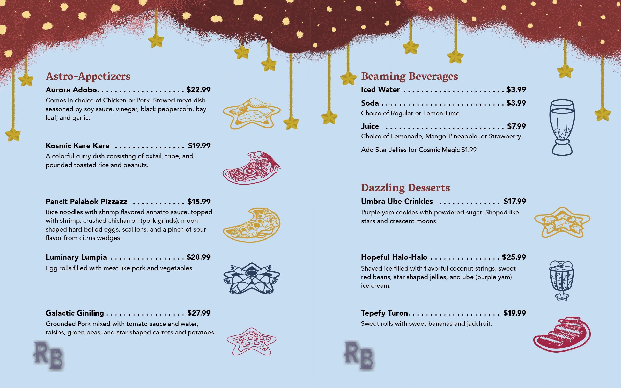
“Sunbaked Space” was a restaurant menu-themed project for my “Design for Production” course. The purpose of the project was to study real-life menus, the elements they contain from text layout versus surrounding graphics, and how to format them into printer spreads. 


My restaurant is a space-themed Filipino Restaurant. My professor prompted me that if I was going to do cultural-specific food, then I would have to combine them with a creative theme to add some original flair. I settled on familiar Filipino dishes my family often makes for me, with a cosmic theme as reference to the stars and sun that decorate the Philippine flag, and a primary color palette also in tribute to the flag. I also drew the dishes onto either star or crescent-shaped dishes to also match the theme. 


I used Adobe Photoshop for the cover and page designs, IBisPaintX for the Food Illustrations, Adobe Illustrator for the logos, and Adobe InDesign for the text and putting the elements together. 

Design for Production | Spring 2026


Illustration

Print Design

Project Proposals

Research

Typography


Digital Flip-Through

    Outer Spread

    Cover Spread for the Menu

    Inner Spread

    Concept Art

    Sunbaked Space Restaurant Logo - Final

    Logos

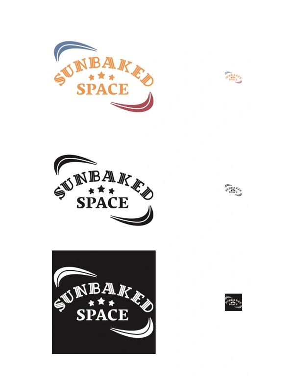
    To fit the themes of Filipino culture and space, I made my logo reflect themes of the Philippine Flag. It utilizes primary colors (yellow, blue, and red) much like the flag, though the yellow is darker with added magenta for better legibility. It also has three stars reflecting the three stars of the Philippine islands. To incorporate the blue and red, I put them on some curves almost mimicking Saturn’s rings. (Also, blue always has to be first on the logo since blue being up on the Philippine flag represents peace, and red on top means war, and this restaurant is meant to be peaceful)!

    Sunbaked Space Restaurant Logo - First Draft

    Some things I changed on the final design was to make each element more legible. I originally put the stars on the logotype, but they were hard to see when scaled down so I hand drew them. I also made the blue and red rings wider on the final design, and changed the “Space” word into a serif font to match with “Sunbaked.”

    Menu Layout Sketches

    Not much from the sketches from the layout really changed, but I tried to balance the space and Filipino-culture themes for my menu. I kept the primary color palette, made a Milky-Way inspired cover page, filled the inner pages with stars and red clouds, and put a mini Philippine hut under a starry-sky that frames the restaurant backstory.

    Want to See the Rest of My Adventure?

    Back to Top
    Back To Student Work
    Back to Homepage

    Copyright © 2026 rachellebaisa.com - All Rights Reserved.

    Powered by

    This website uses cookies.

    We use cookies to analyze website traffic and optimize your website experience. By accepting our use of cookies, your data will be aggregated with all other user data.

    Accept